One important part of a retailer is their supply chain network. In order to sell a product in our stores, or online at Target.com, we need to have a well run and maintained network to move all of those products from one place to another. It may not sound like a complex problem to ship products from a distribution center to a store, but as soon as you start to have multiple vendors with multiple stores (not to mention online orders that go directly to a guest’s home) it becomes increasingly complex. Retailers get products from companies, referred to as vendors, and then distribute the products to stores through central locations, referred to as distribution centers (DCs). In order to improve throughput of our supply chain network we expand our distribution network by building new distribution centers or we increasing the efficiency of the current network. A great way to improve performance of a DC is to put robots and other automation equipment in it. High tech equipment like this requires high skilled labor to maintain and manage the equipment. These highly automated systems run on servers and other control equipment and they produce a lot of machine data that can lead to valuable insights.
Robotics has always been an interest of mine, starting with my experience in high school with the FIRST Robotics Competition and continuing today as I volunteer with FIRST. When I first joined Target right out of school with a degree in Electrical Engineering my curiosity and interest in robotics led me to get to know some of the engineers who worked on the robotics systems within Target’s DCs. I mentioned to them that I was working with a tool called Splunk that did a good job of aggregating data from different sources to a central location with a visualization platform built in. The engineers said they had a very cumbersome, inconsistent manual process which involved multiple spreadsheets and home grown macros to gather and visualize data. The data was spread out through multiple different locations and each different location had files that had the same names as the other locations. The files required advanced access to servers and then once someone got access to the data it was hard to manually move the files to a location where you could interact with them. Once the files were all on your computer and you could open them up in a program like Excel, it was a nightmare to try and parse and make sense of the data. There was so much data and it was so cryptic that it took over four hours (even with a macro that had been developed) each week to make a table that could show useful insights to how the robots were operating for each DC. High level reports were made for all the DCs that had these machines in them, but to initially make that report took over 300 man hours, and then an additional 5 hours each week to update the initial report.
These processes were not sustainable and resulted in reports being generated with incorrect or missing data. Often times reports would simply not get created leaving Target with no insights from the data. When reports were made correctly the best way to share them was via email, but then there were problems with not everyone having the reports or at least the correct version of the reports. Even when everyone had the correct reports, the reports were still somewhat cryptic and relied upon end users manually looking up error codes to see what kind of information the report was telling them.
Automation
Automating and simplifying these reports started off with a simple prototype that just took the raw data and aggregated it so you could see it all in one view at a machine and at a building level. It was a very simple table interface that was created by counting the number of errors for each robot and a lookup table that converted the error codes from numbers with sub error code numbers to words with useful easy to read English descriptions. Next we put a heat map over the data so someone could quickly take a glance at the visualization and see if a particular error was happening across multiple machines or buildings or if a particular robot was having multiple errors. We had it set to update once every hour, although it could have been set to be updated continuously.
We also set an alert so that it would send us an email if a server stopped sending data. Even before we were able to realize information from the improved dynamic report, we were able to find that our servers were not set up properly because we kept getting alerts that servers were not generating logs. This was because our servers would get rebooted, but the log forwarding service would not start. After a little while it started to appear that the robotics system was running worse; there were more and more errors than there had ever been before. After looking at the raw logs to verify that our new automated process was not broken, we found out that the old report was actually missing over half the errors because it could not properly handle some errors and the way they were formatted. Quickly we began to understand how much room there was for improvement; not just the error patterns we were seeking to understand, but more importantly that we an opportunity to improve the reliability of the infrastructure itself.
Operational Efficiency
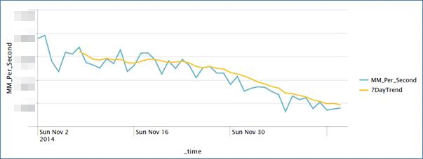
We made a couple of simple graphs that just showed some some variables over time just to demonstrate what else we could do with the data. To encourage broader adoption of the benefits we were seeing, we showed this report to other engineers that manage and analyze similar automation systems. Seeing the potential to visualize, share, and alert on so much data in real time were strong selling point for them. They all saw the potential of what could be done with the data and started to create graphs, tables, dashboards, alerts, and other ad-hoc reports. Shortly after the other engineers made a graph from raw data that could fit the movement of the robots to a formula – now, whenever something is tweaked (maintenance schedule, sensors, parts, etc.) they were able to tell within a matter of days how it was affecting the components whereas before it would take at least a year before someone could visually notice the difference.
All of us gathered our successes and we shared these results with others; they were amazed at how quickly we were able to create reports with so much data in them. Everyone began to realize that the feedback loop between robot and engineer became much smaller which allowed them to take actions quicker and more frequently. Later that year at an industry conference, the maker of the robots highlighted our advancements in supply chain machine data analysis.
The team has since created many more graphs for both technical users and other business users to show how the DCs are operating.
- The graphs help to drive productivity by giving accountability to those that are maintaining the equipment (e.g. if something is suffering from chronic failure we can easily check if machines require better maintenance).
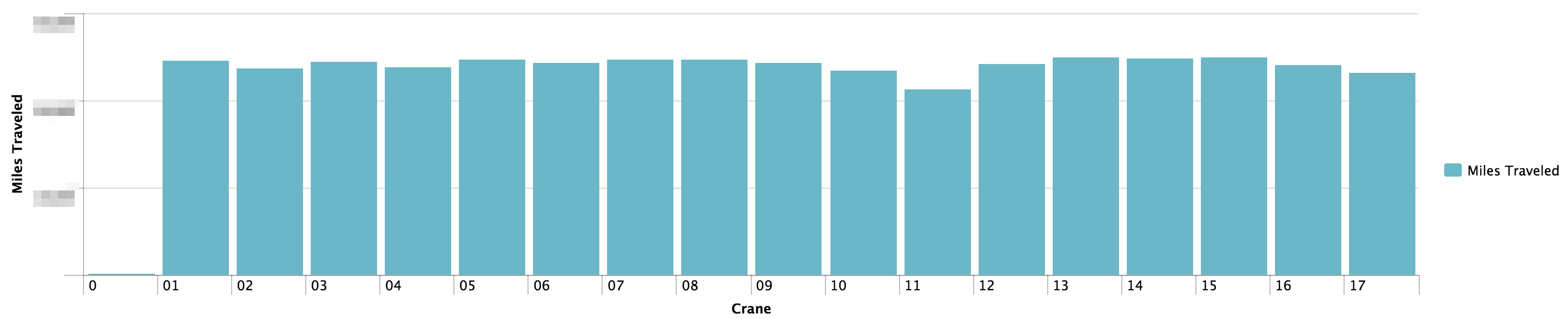
- Target can now perform preventative maintenance based on miles traveled, rather than just a timeframe. We can also see the trend of different metrics and perform maintenance before high usage days. This will save on doing maintenance that was not needed, and it will prevent downtime by doing preventative maintenance before something breaks.
With just this small scope implemented, significant money will be saved by increasing throughput by 4% per building. The data we now get can also show us that we should be processing different kinds of freight with different machinery. For example, some freight stays in the DCs for much less time, but we were not leveraging our automation systems there as often. This data showed us that we should be using it more, even if it is a smaller percentage of the inventory within a DC, this alone can increase throughput by 2% resulting in another impactful cost saving.
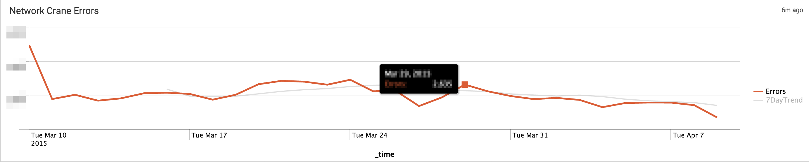
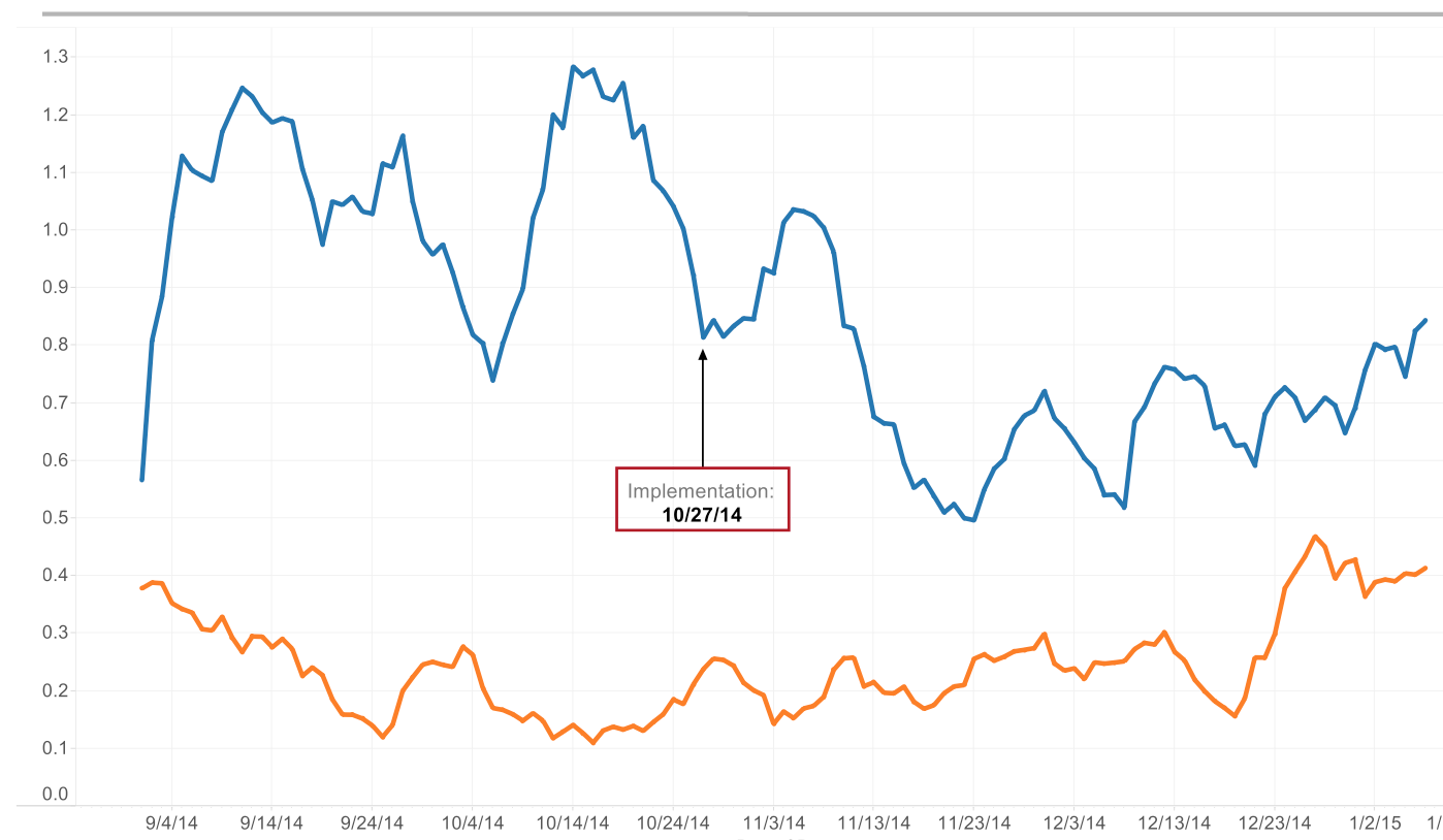
We have been able to objectively prove with more accuracy than ever that some buildings operate better than others. Since we have implemented these big data tools the amount of errors in a ‘bad building’ have dropped dramatically, as shown by this graph:
Next Steps
Now that we have proven that we can gather quick wins from this data, we are exploring big data solutions that will allow us to create machine learning models to let us know when something is going to fail before it actually does. We are actively creating predictive models by leveraging a wide assortment of tools (LogStash, Kafka, Hadoop, R, Splunk, InfluxDB, statsd, Grafana, etc.)
Shoutouts
Thank you to Paul Delfava, Adam McNeil, and Trevor Stratmann for jumping on board with this and making it happen!